Next Project
GIC Recruitment
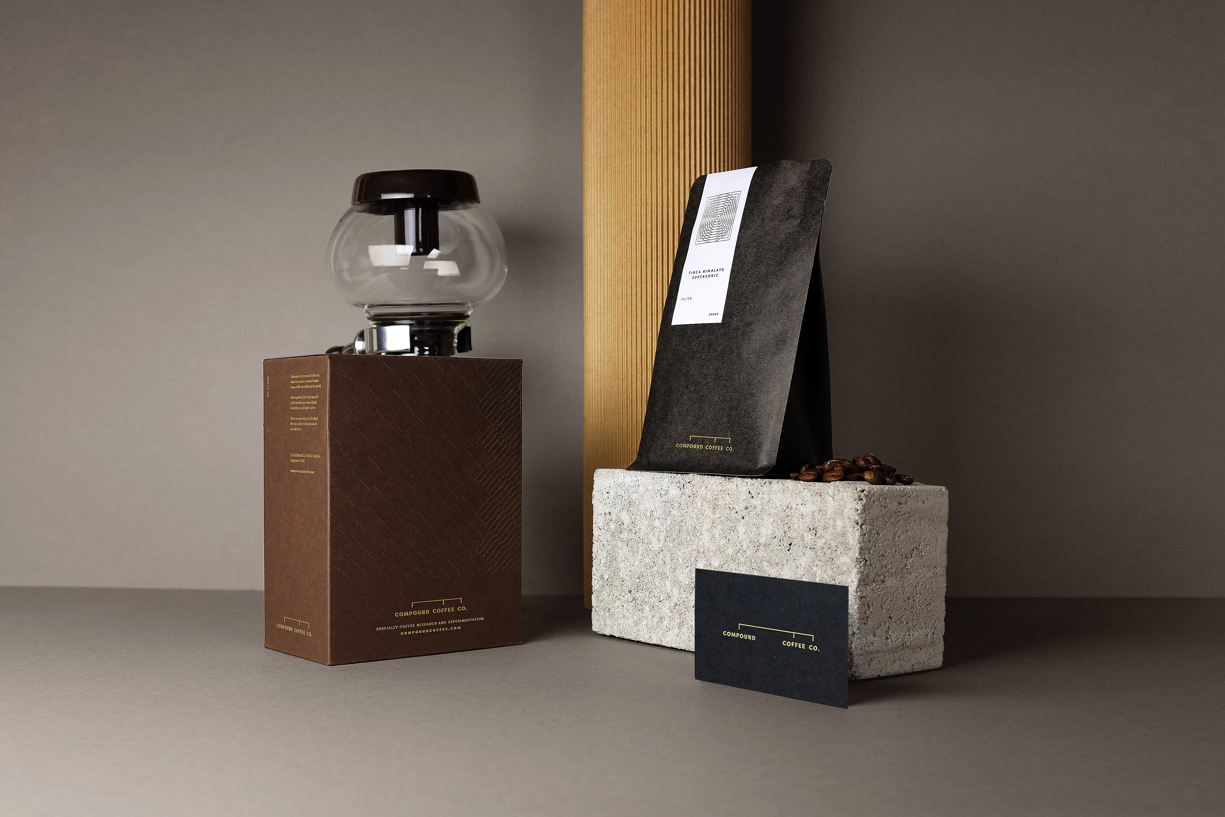
Compound Coffee Company
Food & Beverage
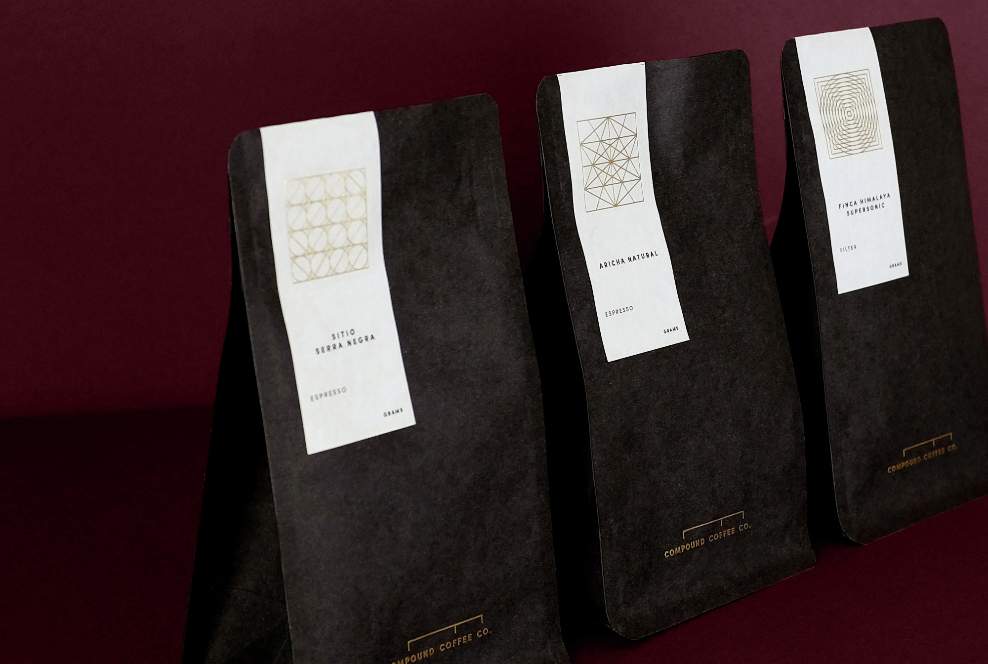
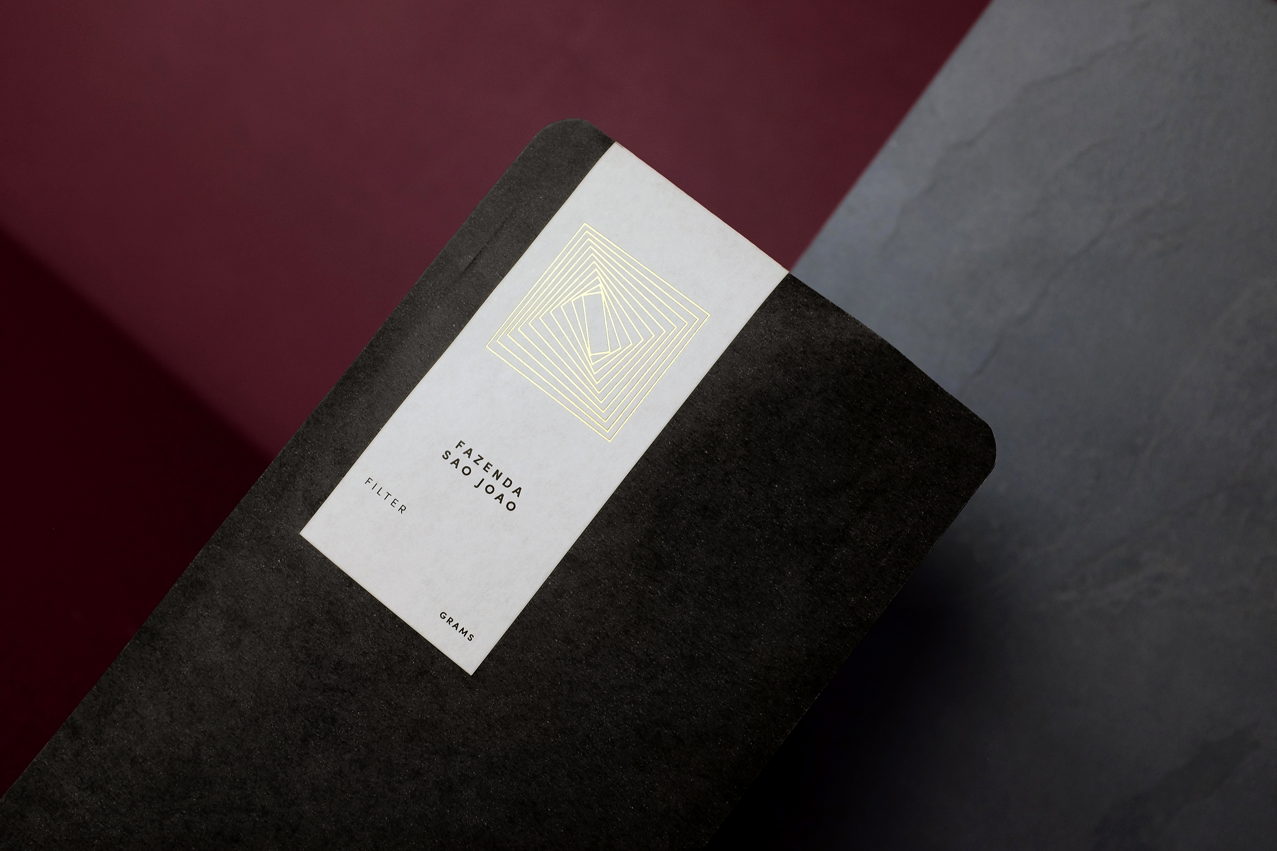
Compound: A new substance made when two or more substances chemically combine. The Logotype is directly inspired by chemistry flow charts. It immediately associates the business name with the visual identity and does not leave much room for brand confusion.
With just a glance, the presentation seems almost scientific, which resonates with the company’s vision to be Singapore’s leading coffee roastery in specialty coffee research and experimentation. The design which features a “link” also highlights the founder’s belief that good coffee is a combined effort from many aspects – from the farmers to the roasters and finally, the barista.

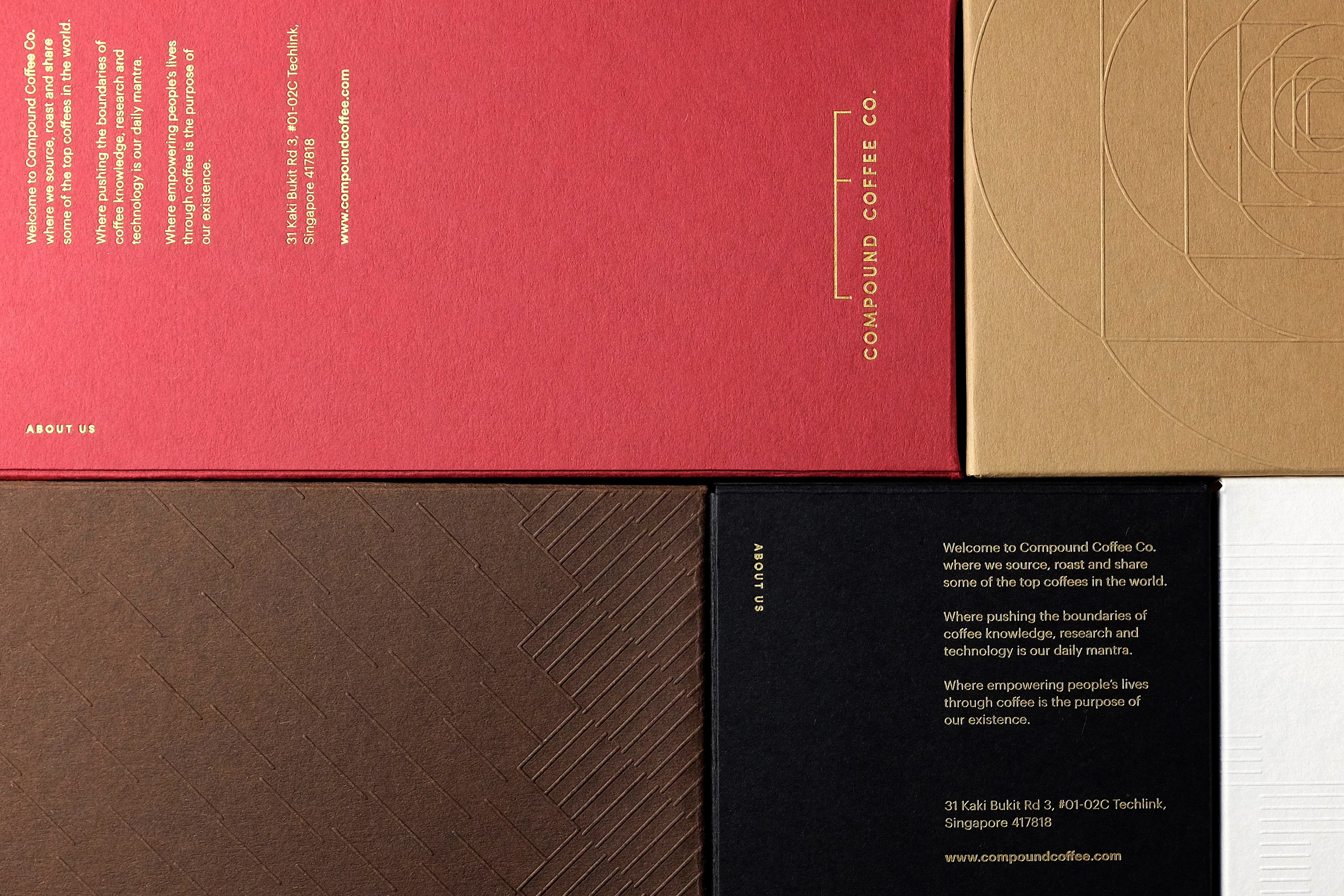


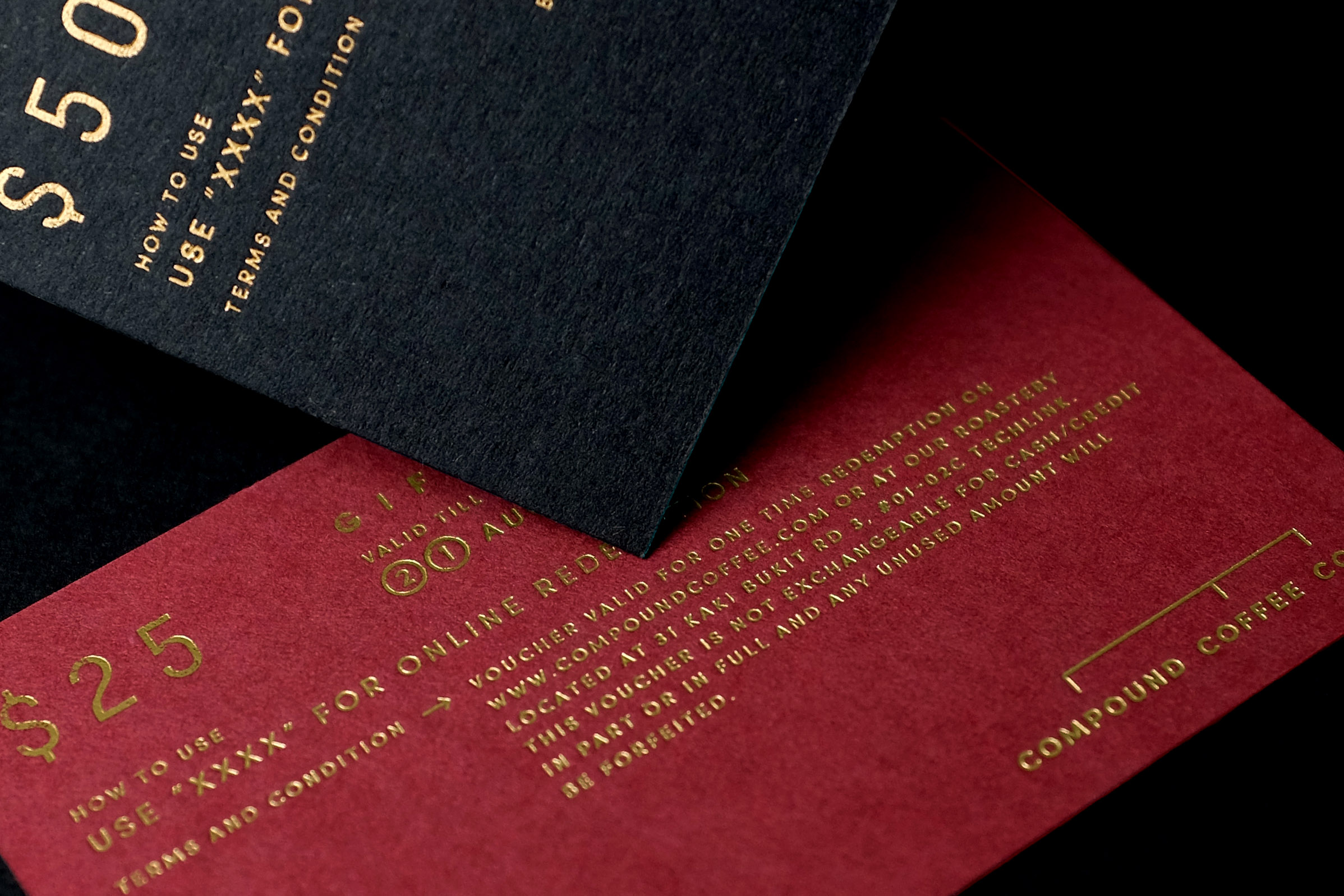
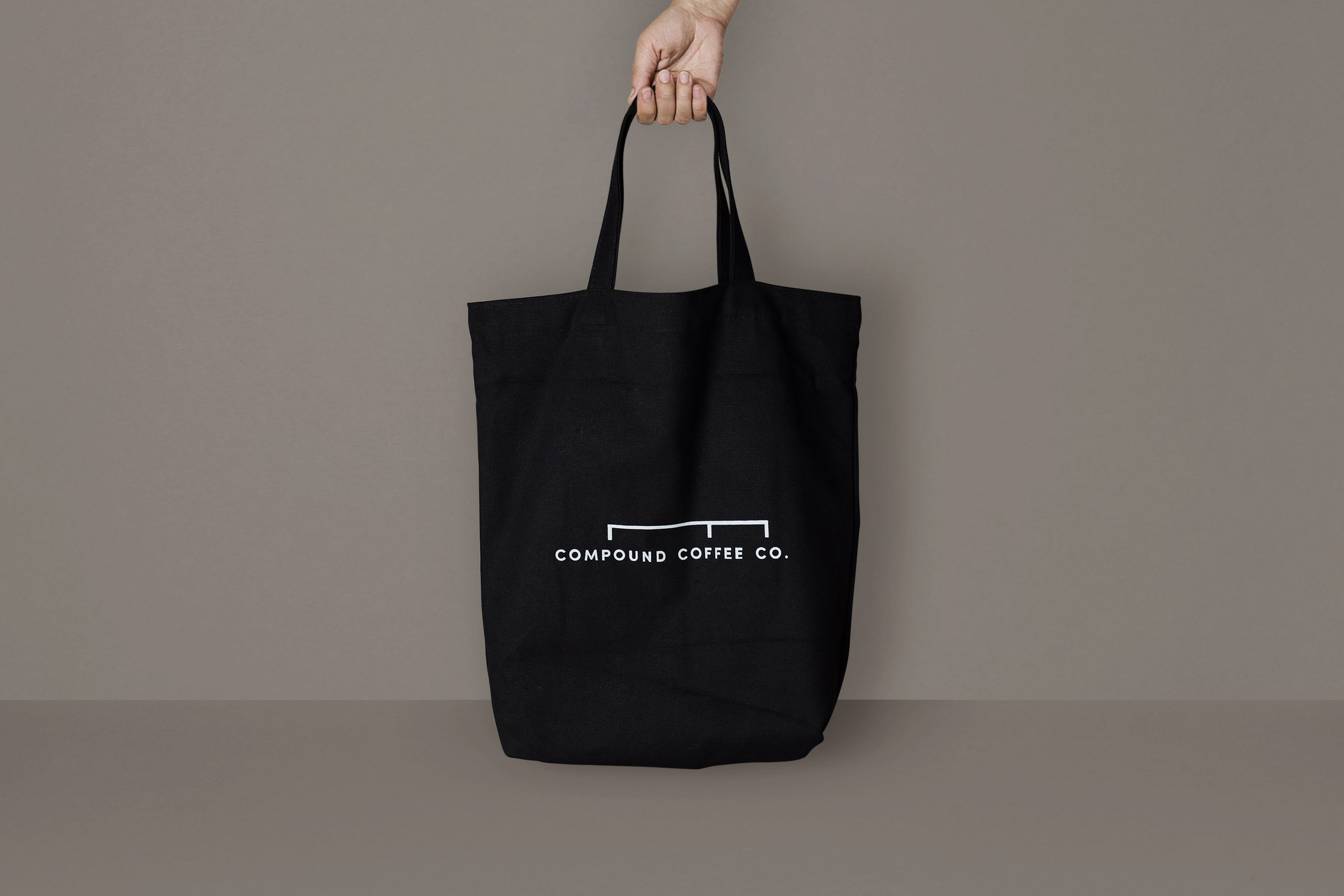
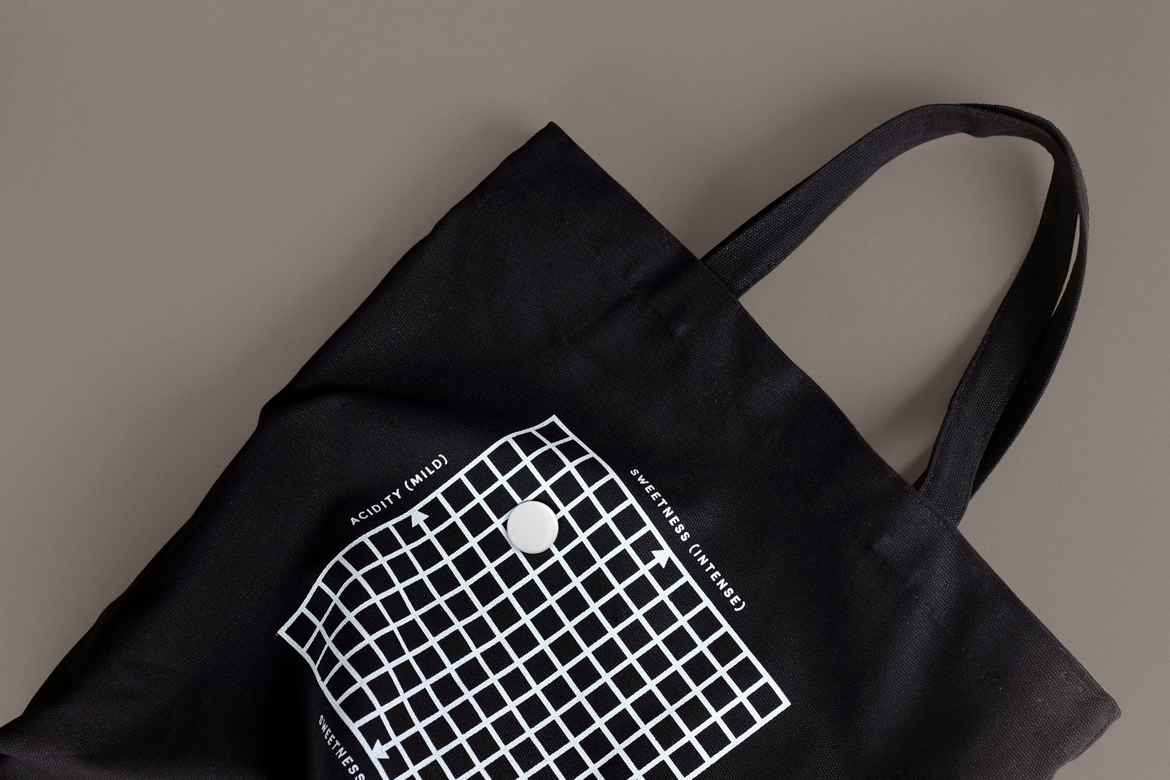
The brand is a living entity which changes in response to the surface it is a applied to. The word “Compound” could be displaced and the line between “Compound” and “Coffee” could be stretched to obtain a unique and contemporary effect which is representative of the brand. This application strengthens the graphic identity and animates the communications with a range of styles.


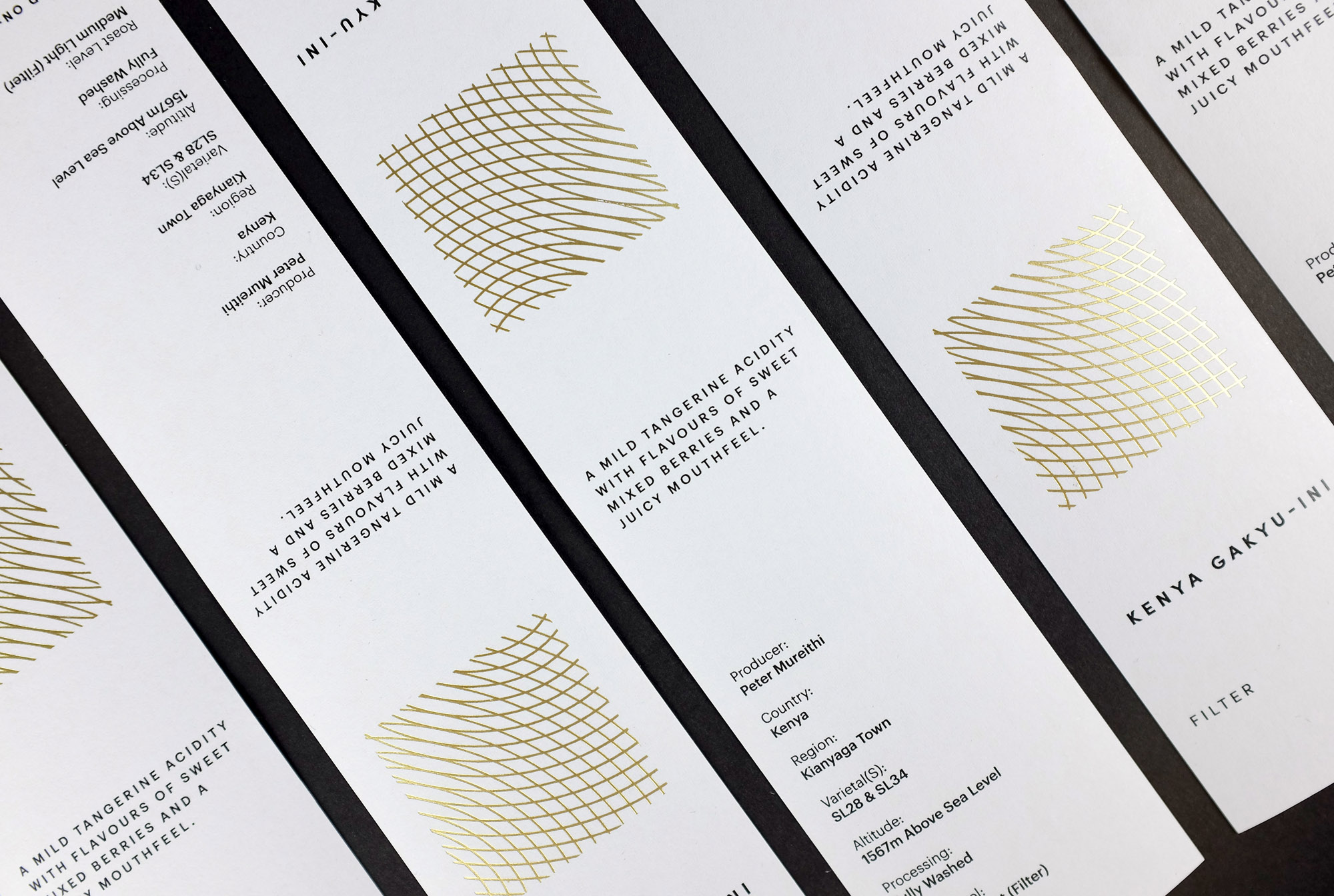
The approach to campaign and branding posters was focused on clean typographic design without being too rigid.
Rich and generous negative space contrasts with the use of bold typefaces. The layout of the elements is rhythmic and leads the eye to the logotype. Short description texts are justified and give a classic yet contemporary look. The loose letterspacing is intriguing and prompts readers to discover more.